

Centre Brand Refresh
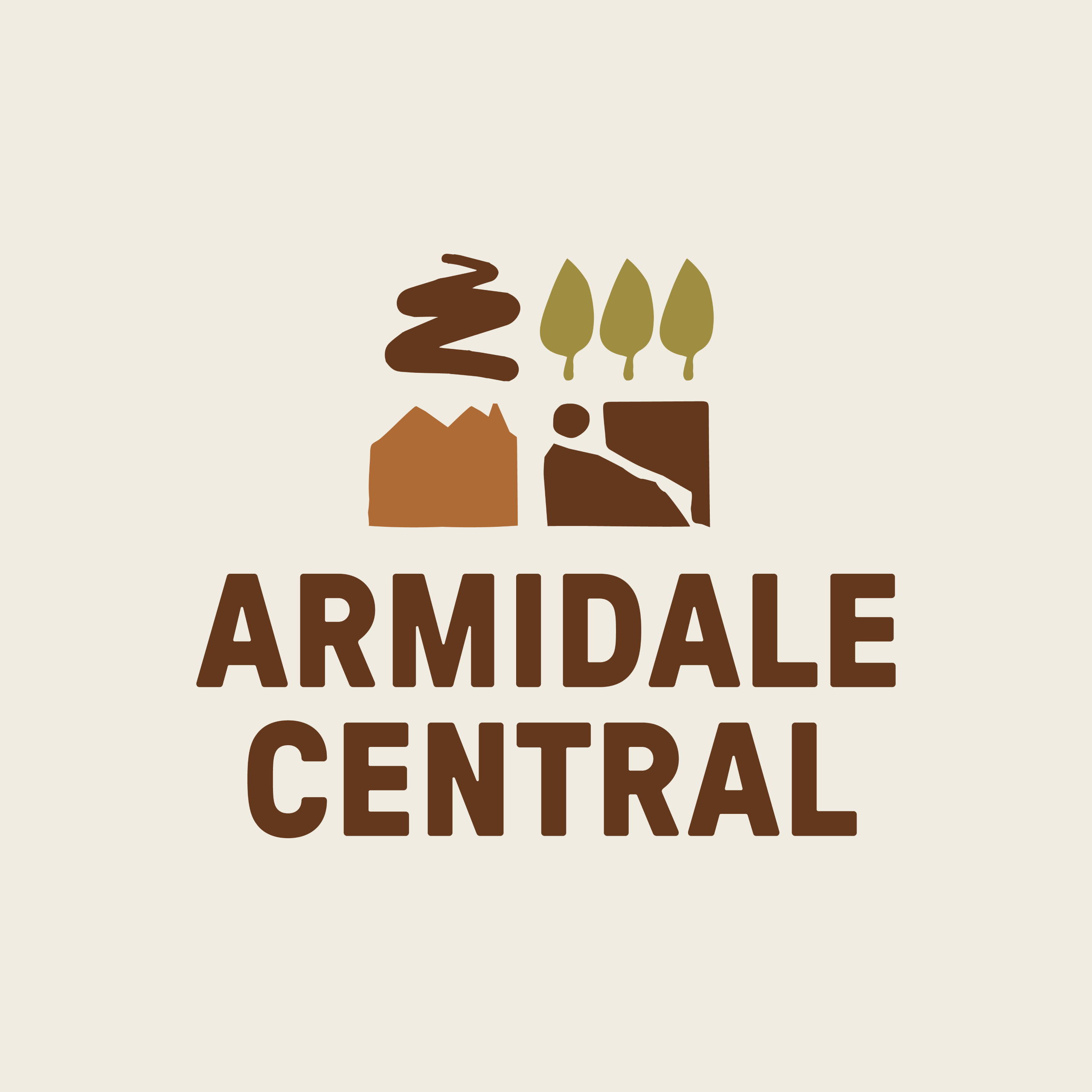
The name “Armidale Central” will proudly remain, continuing its strong connection to the New England region. Alongside this, we’re introducing four new logo marques designed to modernise our identity. Each element draws inspiration from the distinct landscape, culture and creative spirit that define Armidale.
Perched on the New England Tablelands, Armidale combines academic energy with natural drama — elm‑lined streets that turn gold in autumn, heritage architecture, farmlands, and rugged gorge country shaped by cascading waterfalls and winding waterways. These features have guided the development of our refreshed icons and colour palette.
Our four new icons represent:
- Autumnal Tree Lines – inspired by Armidale’s iconic deciduous streets, where elm, oak and plane trees transform the city with vibrant autumn colour each year.
- Scenic Drives – reflecting the sweeping routes that define the region, including the famous Waterfall Way, which carries travellers through gorges, national parks and open countryside.
- Heritage Architecture – honouring Armidale’s historic character, from its cathedrals and federation buildings to the heritage precincts that celebrate the city’s academic and cultural story.
- Pastoral Lands – representing the agricultural backbone of the New England region, with rolling hills, grazing country and long‑standing farming communities that surround Armidale.
These shapes are intentionally abstract — designed to evoke the feeling of Armidale’s natural environment and lifestyle, rather than serve as literal illustrations.
Thank you for your support as we bring this next chapter of Armidale Central to life through a staged rollout.